
Responsive Design on Steroids: Be Responsive to Your Visitors
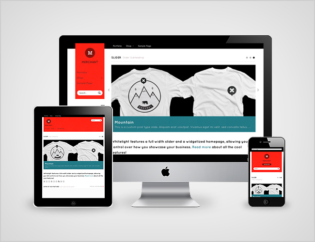
The buzz word currently in the web design and development circles is responsive design. Responsive design simply put is a way of designing a website that accommodates visitors on all types of devices. The website will scale based on the users screen size so the viewing experience is not degraded just because you decided to surf on your phone, tablet or any other device. This makes for an all round better experience for the user.
Today I am not here to write about responsive design, instead I want to talk about what are the potential applications of responsive design and how far can you take responsive design. Can you make your website responsive to not only the users screen size, why not make the website responsive on the user themselves. Why cant your website changed based on the demographic of the user. To create a truly personalised experience for the user. Well you can and I will show you how below.

So lets put this in context , you have a user who types your searches you via Google on their ipad. They find your listing (hopefully your ranked 1, if not read some of my other articles to get there) they click on your link and then your site loads. Your site is an eCommerce site selling Mens and Womens UggBoots.
Now traditionally your home page would have a large “hero Image” more than likely rotating through your current featured products. Mens and Womens mixed in with no real way of being able to show only mens images to the men and only womens images to women. If say for instance the first few images were womens uggboots and your visitor was looking for mens uggboots then that may result in a bounce.
Here is where technology can assist, there is now a way to pickup demographic information on the user and tailor your website for that user. Say for instance if the user is logged in and they have registered with your site. You will then be able to see certain information on that customer, their name and what they have bought in the past. Using their name you can ascertain whether they are male or female and show them relevant content based on whether they are male or female. The system will have a list of all names and whether they generally are male or female in origin obviously with so many names in the world sometimes a name may not exist. In this instance the server would return a “Gender Neutral Hero Image that would appeal to both Men and Women. It would also return this image if the name could be used for both male and females.
This basic level of customisation would increase the conversions of your visitors as they are having content delivered to them which is relevant to them. This is only a very basic implementation of what is possible with this new technology. Adobe is one of the companies who are actively using this technology to create web-based applications that have personalised online experiences. More information on what adobe is doing with customised user experiences can be found on the Adobe CQ website
This type of user customisation will generate increased conversion for your sites and I suggest reviewing what can be accomplished with this technology. The sky is the limit and as we move more and more to the cloud it makes a compelling case to use this technology to improve customers experiences online.
| Hosting Options & Info | VPS | Web Solutions & Services |
|---|---|---|