
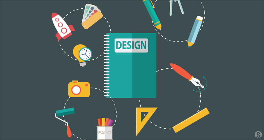
Future Trends in Graphic Design for Your Website
Since design is more of an art than exact science, one cannot determine clear scientific formula to successful graphic design, however, there are certain patterns which seem to simply work better than others and tend to reappear time and again. These popular design trends gained recognition by modern web designers who are capable of pushing the boundaries and bringing the design to the next level. Today, we are taking a closer look at two trends which are making their breakthrough as we speak – Ghost Buttons and Feature List Icons.
Ghost Buttons
Definitely one of the fastest growing trends in the web design industry, ghost buttons follow in the footsteps of flat UI design, using a single color background with a seemingly two-dimensional appearance, while also being empty or semi-transparent by default. Ghost buttons light up on hover, often look like boxes with colorful borders and their button look is created by rounding corners and using extra padding around the text.
Header designs often use different color schemes, as properties like color, font size and style can be used to draw more attention towards certain buttons on your web page. Contrast is also a popular way of creating that coveted distinguishing look between buttons. Many homepages are designed in such a way that their header uses a ghost button next to a regular flat button design. The ghost button usually leads to something less important as opposed to regular flat buttons. As ghost buttons seem empty, they tend to fall into the background, thus propelling a visitor to notice the flat button more clearly. Ghost buttons are a perfect choice for minimalistic layouts. Less is more, indeed.
List Icons
Most mobile apps or startups use this method to outline the features of their blocks of text. Homepages usually feature a list of concise sentences along with small icons. These text-based lists sometimes use icons to help describe the features being listed. For example, which services are provided by a startup or the features of a certain piece of software. List icons are becoming more and more popular and this trend is currently being used by hundreds of various web pages.
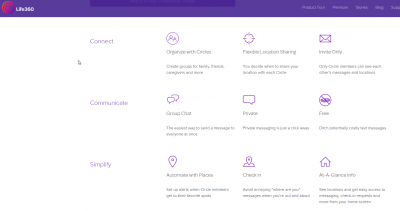
Many mobile apps (like Life360, for instance) use this landing page design because it is well organized and uses quite a clear collection of features with icons. Life360 uses some features that are broken up into horizontal rows at the bottom of its homepage, and each row begins with a heading and lists three features alongside each other, while these features also use icons to convey a visual meaning. It is both useful and elegant a solution.
These lists, however, don’t always list features, as they can also go in-depth about how to perform particular actions – explaining how your visitor would go from purchasing your service to the final outcome, for instance. Designers who discovered this trend also tend to build on top of it always find new methods and uses for icons and pieces of featured content with explanatory purposes.
-
The Biz Rule