
4 Simple Rules to Choosing The Right Font
Although this should be a fun and enjoyable process, choosing the right font is sometimes just a huge pain in the neck. Nothing seems to be working, and there are endless possibilities to choose from: conventional fonts are boring, and some of those weird ones are, well, just weird. When you hit a designer’s block of this kind, it’s perhaps best to go outside and clear your head for a while, but once you get back to work, it’s time to get the job done.
Now, when this moment comes, one needs to be both creative and rational. Selecting the right font should be a fine blend of rules and sheer intuition, but it does require a certain amount of experience. In order to get there a bit more quickly, you might want to consider the following tips and guidelines for choosing the right font (if there is one, anyway).
When Nothing Else Works, Stick To the Classics
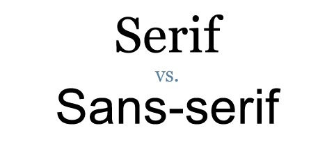
Make sure you find some of the fonts that will be your workhorses. Every designer should have a few of these that can fit anywhere and go well with everything. These fonts are usually rather simple and seem to blend with almost any surroundings, but also have the ability to be perceived as formal. Think Sans-serif typefaces, almost any of them – Arial, Calibri, Verdana, Helvetica, Raleway, Ubuntu (just not Comic Sans). While Serifs can be quite a useful choice as well – Times New Roman, Cambria, Droid Serif, Georgia, Consolas, etc.
If you’re not sure of the difference between Serif and Sans-serif: Serif typefaces are essentially those that include the sharper ‘tails’ on letters, whereas Sans-serif literally means ‘without Serifs’, with letters containing more rounded edges.
Find the Right Balance
Sometimes it is best to go with the hunch and pick the very first one that feels right. It is kind of similar to picking your clothes for the day, or deciding which album from which band you’ll put on your playlist for the day. However, don’t overthink it or end up making it too personal. Remember, you are not only expressing your unique aesthetic taste, but you are also using it to meet your set objective. Individuality here might be a useful tool, but never let it be your ultimate guideline. Make sure you understand the difference between useful & appropriate, and expressive & stylish, and find the right balance between the two – it’s hard, but not impossible to find.
Contrast Is Good
When you reach the point in which you need to introduce a second font, be sure to avoid small differences. Refrain from putting two similar fonts in one concept, and learn that contrast is one of the most useful things in design. The trick is to either keep it exactly the same, or make an obvious or even conspicuous difference, but never use unconvincing incremental variations. In the end, it all boils down to correspondence and contrast (back to school now, are we?).
Smashing Magazine‘s 2013 research report on typographic design mentions that for headings, Sans-serif typefaces are slightly more favoured and more readable, but for the body of text, Serif typefaces are favoured a lot more.
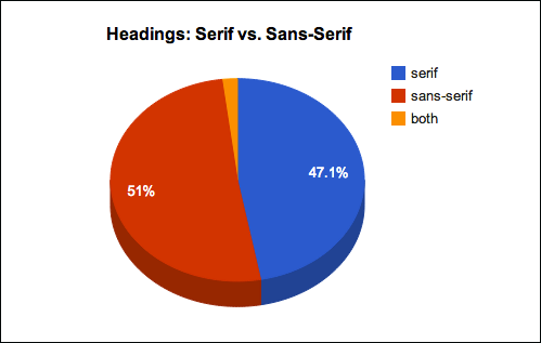
Sourced from: Smashing Magazine
The article also mentions that despite the differences, ‘contrasting a serif body with a sans-serif headline or vice versa can improve the overall visual appeal and readability of a website’.
Experiment (the verb)
The final tip will be a cliché, ‘There Are No Rules’ kind of pointer. Just as you need to have a few of those safe choices in form of workhorse fonts, you will sometimes need to ditch all those conventions, unspoken rules and regulations. Trial and error has led to many of the greatest successes.
Want to A/B test fonts for CRO? Check out our article on Conversion Rate Optimisation tips here.