Google’s New Logo: Why the Change?
Wait, what?
If you don’t know about Google’s branding change, where have you been?
Here’s your homework: Google.com.au.
So yes, Google has changed their logo which comes as major news to many, as it’s been awhile since the logo’s first major change in 1999, where they decided on the quirky font, order of colours, and the dismissal of the exclamation mark. Since then, the logo has just been slightly modified and flattened as the years went by.
![]()
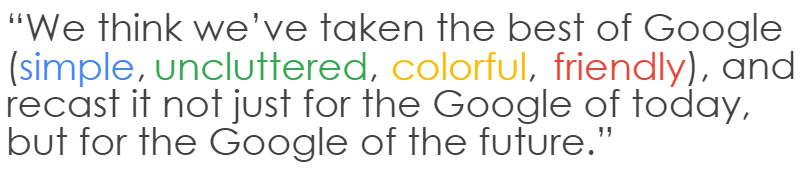
The font is now Sans-Serif (literally, “no serifs”) — dropping the pointy, classical style of font for a rounded, user-friendly font better conveys Google’s simplicity and modern feel. In regards to an IT company, anything that looks simpler makes it feel easier to use.
The traditional Google colours are now a shade lighter than the previous logo, which was essentially a design choice, as they discovered that when they eliminated the whitespace between the previous colours, they were perceived as darker — the new colours avoid this problem.
Alongside the new logotype is a more simplified version, compacted into a colourful Google “G”, that’s striped with all four of Google’s new trophy colours. This new G is also the tab icon (or favicon) for Google Search, and I do not doubt that you’ll be seeing a lot more of it.
As well as the cute little G, they’ve further condensed the logotype into four Google-coloured dots, as “a dynamic distillation for interactive, assistive, and transitional moments.”
If you’re interested in the design of the logo:
https://design.google.com/articles/evolving-the-google-identity/
It’s also pretty cool to see it in all its half-built glory at the Googleplex in California:
![]()
![]()
Photo courtesy of Antoine Naaman
So, why the change?
On Google’s official blog, they announced and explained the branding revamp as well as their motives behind the change. The main idea that resonated was that Google is evolving alongside the world. It mentions that Google was once accessed only on a desktop computer, but now is accessible from anywhere at anytime on a range of different sites, apps, and devices, whether it’s a mobile phone, watch, TV, car dashboard, or desktop. With that change of culture in mind, Google decided to update its look according to the modern environment of today’s digital world.
The new logo reflects the way people use Google and its services.
Optimizing the logo for smaller screens may have been the key motive behind the design. The simpler lettering is intended to be scalable, making it easier to read at any size. It also supports low-bandwidth connections: the previous logo would change to a text-based approximation, whereas the new logo scales easily to another size, without any detriment to its design. Google says that it’s made a version of its logo that’s only 305 bytes, compared to the existing logo at ~14,000 bytes — that’s a 97.8% decrease in size!
The move follows the announcement of a new organisational structure for the company. Alphabet became the parent company run by Google founders Sergey Brin and Larry Page, in order to “separate the money-making search engine, from the loss-creating projects like robot cars, medical research and Internet-delivering balloons”, as The Guardian words it in their article.