
Confluence 5 Brings a Fresh UI
Only just recently did I share our experience with migrating our internal custom KB system to Atlassian Confluence. We’ve been using it for a significant period of time, and our team are making good use of the Confluence wiki. Our team is using it for project planning, documentation, setup guides, known issues, bug tracking, reports and more.
I also personally run my own starter edition wiki for my own personal use, plus I can generally trial new plugins and new releases quicker on my own personal wiki.
I also recently wrote an article about the Evernote plugin and during my research I was aware that Confluence 5 was close to being released. Then just recently I got an email from Atlassian announcing the release of Confluence 5, I quickly added a task to get my personal wiki upgraded to Confluence 5 ASAP, so I could check out the new features.
The email Atlassian sent out made it clear that a new user interface had been rolled in to this release, so I was interested to see what had changed.
Today I am just going to take you through a quick introduction to some of the new features in Confluence 5.
UI Improvements
One of the main focus’s of this upgrade was an overhaul of the user interface (the look and feel). On first login after the upgrade you can not miss that changes. I was greeted with the new ui and a welcome message with a link to a video about the new confluence ui.
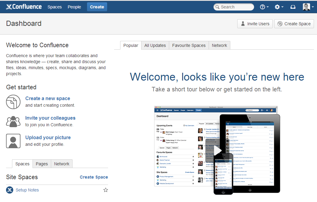
There is always going to be some issues when changing that UI mainly for the end users. I think the video is a great touch to bring people up to speed.
Worth noting is if you read through the Upgrade Notes for this release, Atlassian have taken the time to create a whole section on how to prepare your end users. This is a great touch. As with all new things, sometimes change can be scary.
Atlassian have provided video’s and notes on these big changes. Giving you (the person in charge of upgrading / training) the content necessary to educate your team. Planning for Confluence 5 – https://confluence.atlassian.com/display/DOC/Planning+for+Confluence+5
Create Button
Previously with prior releases of Confluence if you wanted to add a new page, blog post etc, you browsed to the particular space, then selected the Add button and chose your options.
This has now been replace with a single “Create” button in the top banner. From here you can create a new blank page, page from template, blog post etc and choose what space / page to put it under.
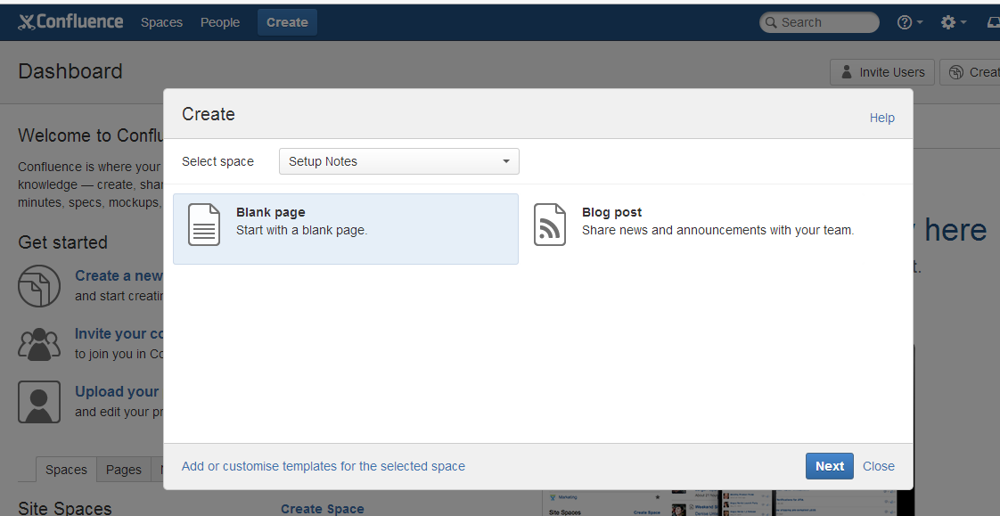
I think this is a great idea. A one stop location for getting your creating content. Simpler and more efficient.
New Side Bar
Confluence 5 has introduced a side bar when you are browsing spaces or pages. The side bar can be customized to include shortcuts to your favorite or frequently used space’s or page.
It also provide a navigation for child pages depending on what space / page you are viewing.
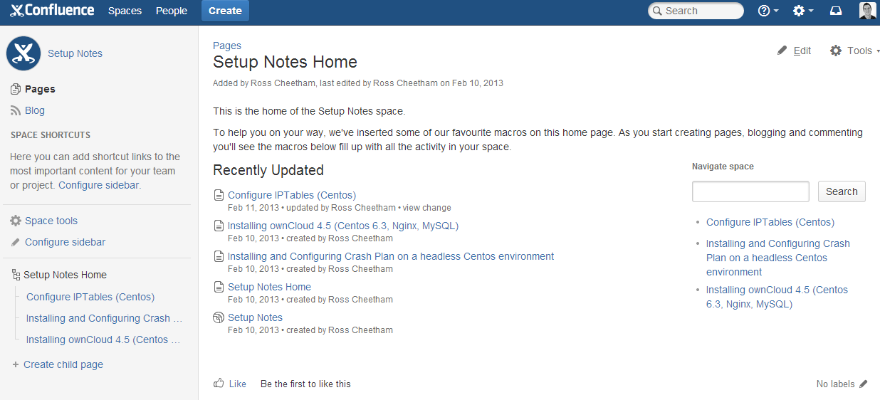
So when I am browsing my setup notes space, you can see that it provides quick access to some of the pages that are available.
They have moved the space options to the side bar as well instead of cluttering up the top bar, this is a positive move to reduce the clutter in the top bar. This side bar has replaced the older “Browse” men option.
Editor Improvements
Although I have not heavily tested this yet, when editing a page I noticed the load time once you hit “Edit” has improve dramatically.
Atlassian have got some serious speed improvements for the Editor in Confluence 5. The editor has also experienced some UI changes to maximise screen space.
Conclusion
Though this is early days getting familiar with Confluence 5, I have no major complaints just yet. The new UI is fresh and so far easy to use. The speed improvements are noticeable and my current favorite plugin (Evernote Plugin) still works in Confluence 5.
I have one little gripe so far though, Confluence 5 introduces “round” space logos. So if you are upgrading an existing Confluence install, you may need to review your logo’s for spaces, as they may get a little ruined or look a bit funny after they have been “rounded”. Not sure why Atlassian chose the round logo approach, it is a minor issue though, but some logos do not fit in a round shape, so would of been good to “choose” the shape.
From reading through the Confluence 5 release notes, there are a large number of other changes. If you are curious to see them all here are some useful links,
- Planning for Confluence 5 – https://confluence.atlassian.com/display/DOC/Planning+for+Confluence+5
- Confluence 5 Release Notes – https://confluence.atlassian.com/display/DOC/Confluence+5.0+Release+Notes
- Confluence 5 Upgrade Notes – https://confluence.atlassian.com/display/DOC/Confluence+5.0+Upgrade+Notes
- Confluence Whats New Page – http://www.atlassian.com/en/software/confluence/whats-new/confluence-50
Now I have to start planning the upgrade of our Crucial Confluence Wiki, so the team can benefit from this new release.
I would love to hear from anyone who has upgraded already. Feel free to share your thoughts on the new release.
| Hosting Options & Info | VPS | Web Solutions & Services |
|---|---|---|
-
Matt Hodges
-
Matt Hodges