
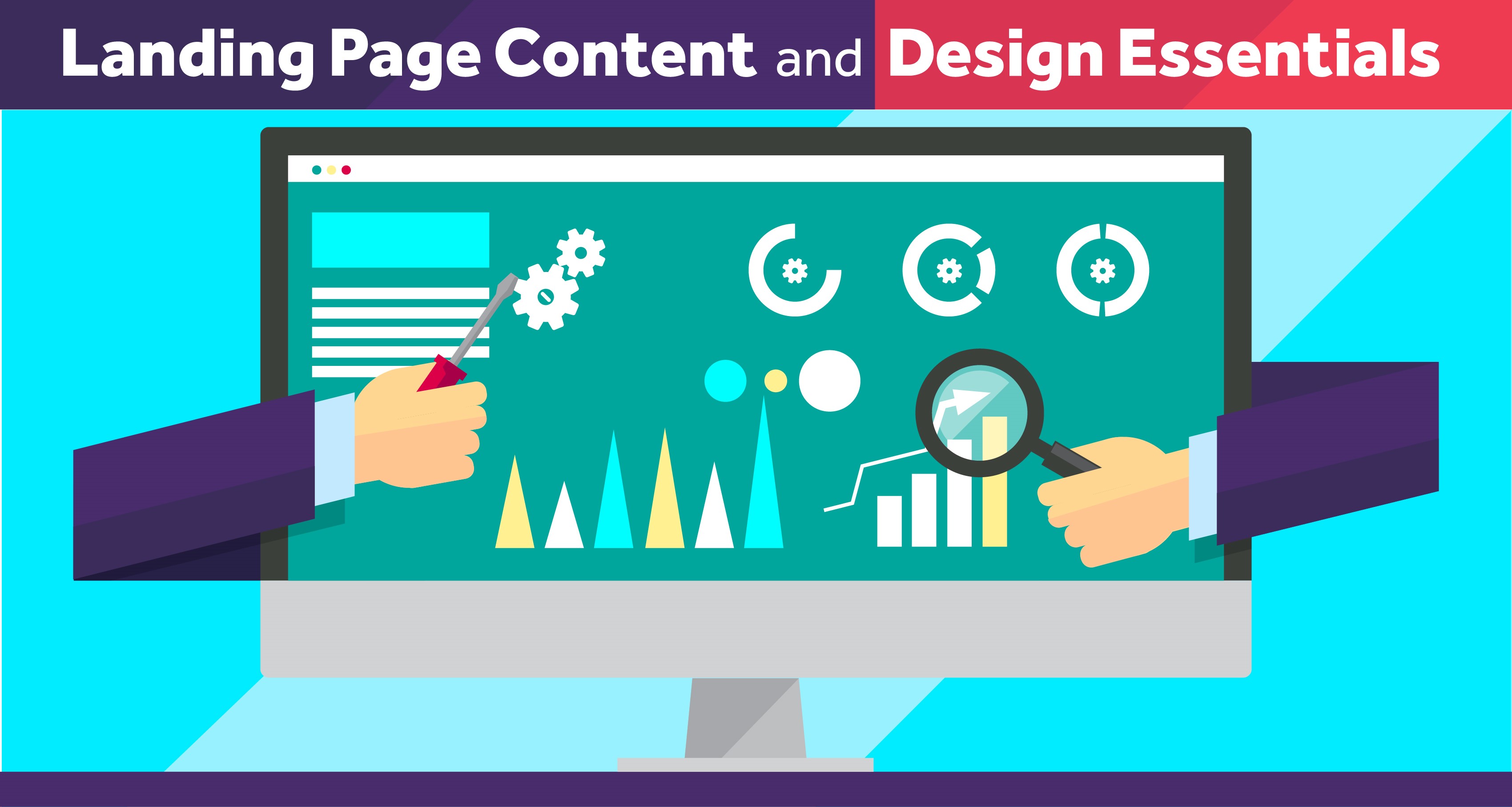
Landing Page Content and Design Essentials
Can you hear the cha-ching of your website traffic? A high-converting landing page is one of the leading factors of success in online marketing and that is why designers need to create pages capable of grabbing visitors’ attention, keeping them on the page, and directing them towards a single goal.
When it comes to the basics of creating a landing page, these are the key points you need to keep in mind, so you can achieve remarkable results. Include catchy above-the-fold content and images, trust-inspiring headlines, illustrative hero shots, CTAs that command attention, and credible social support for your offering.
Sounds hazy? Let’s break it down into points — planning an effective landing page is easier than you think.
Create attention-grabbing headlines
Grab your website visitors’ attention immediately with a cool graphic, a short yet persuasive headline, and a catchy hero shot. Head turning above-the-fold content and images will keep website visitors scrolling down through your website instead of leaving your page. Creating content that will funnel them into conversion for things like – order products, share their info or download your content.
Here is how to create a killer UVP (Unique Value Proposition):
- Effective simplicity – Make the main headline straightforward, punchy (wit is always an asset in marketing) and center it on the end goal of the viewer.
- Don’t waste words – Do not go brand bragging: users should find the primary and supporting headline concise yet sufficiently instructive. If you cannot cram a lengthy message you wish to convey in the main headline, extend it naturally to the sub-header and reinforcing statement.
- Design savvy – The above-the-fold should feature big, bold letters and an interesting graphic with colors that command attention while neatly encapsulating your business philosophy.
Website viewers do not scroll unless truly impressed by the above-the-fold, so you need to seize your audience fast here if you want to profit from website traffic.
A hero shot that stands out in the crowd
The hero shot on your landing page can be a large, easy-to-understand picture, animation, or a short demo underscoring your offering’s best aspects. Here are some tips on how to pick the right above-the-fold illustration:
- Minimalism is a must – Present the offering in a way that is immediately relevant to the viewer, e.g. illustrate the use of the product or the end-purpose of the service from the visitor’s point of view.
- Hero front and center – The hero image should be located at the center of the page, with words in bold font and contrasting tones to make the promo message stand out.
- Train the visitor’s eyes – Directional cues naturally lead the viewer’s gaze to the object of the promotional campaign. Studies show that people are more likely to follow the gaze of an individual in the picture than to pick out the target from a host of displayed objects on their own (humans are lazy creatures of habit – no remedying psychological conditioning there).
If you are lacking inspiration, you can check out memorable above-the-folds that helped major international brands go up the corporate ladder in a flash and try replicating winning formulas – just don’t be overly blatant in your sly copycat endeavors.
Call ‘em to action now
Cool, witty headlines and catchy hero shots alone do not make a successful landing page. Effective call to actions that prompt the visitor to take the next step is essential to getting results. Even some simple tweaks such as those outlined below can greatly change the way your landing page works.
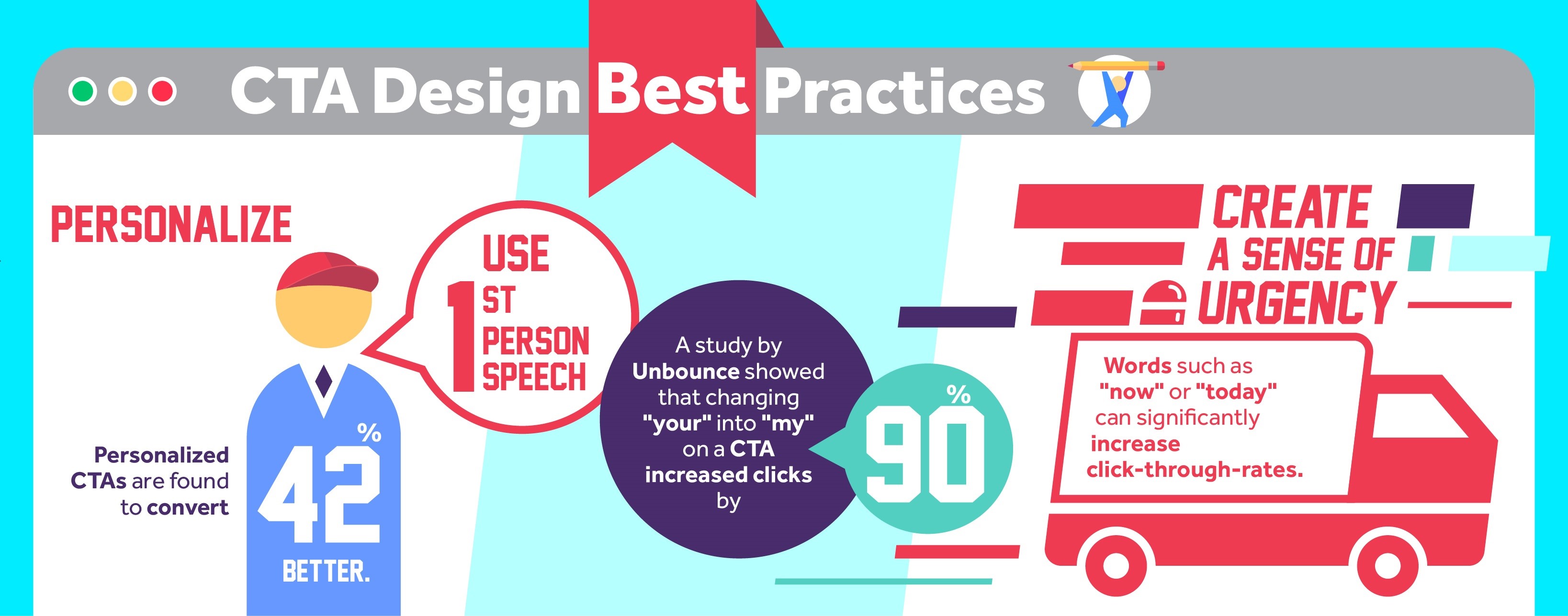
- Personalize – Make the call to action (CTA) crystal-clear by using straightforward, personalized statements as they can up conversion by as many as 42%. A study by Unbounce shows that switching from ‘yours’ to ‘mine’ in the CTA button can up conversion rates by as many as 90%. The CTA button can make you money as you sleep, if cleverly worded.
- Clarity is the key – CTA content depends on the type of action you want the viewer to take, e.g. sign up for a newsletter, download an e-book, order a product, or share their personal information with you. Keep the call immediate: statements such as “Order your copy now” or “Sign up for a free trial today” narrow down the time of action to the present moment, leaving no room for delayed response.
- Contrast for bonus clicks – The CTA should stand out from the rest of the page layout in terms of color. Use CTA button tones that contrast well against overall website color scheme, such as red, navy blue, or light green to prompt the visitor to act.
Build the viewer’s trust through benefits
Spoon-feed the viewer basic information on your offering’s effects through benefit statements. Moving away from attention-grabbers and keepers, the viewer should learn about the positive consequences of your service or merchandise so as not to bounce off to a competitor’s website. Make the benefits neat, sweet, and catchy following these guidelines:
- Client satisfaction, not company profits – Brands that sell well put client satisfaction above profits. Users like to know that their time and money are highly appreciated, so they respond better to personalized statements starring them (i.e. ‘your time/life/pleasure’) than those structured around the company and offering (i.e. ‘our product/service/e-book’).
- Focus on immediate consequences – Benefits sell effects, not features, so if you want to include both in your landing page, organize them into two visually separate units, benefits being more prominent.
- Concise and clear – Reinforce the viewer’s trust in the quality of your offering by displaying benefits as bullets in bold font.
If you have done your job well up to this point, your viewers are already taking the bait, they just need a bit of reinforcement to hit the right button.
Back your goods up with persuasive support
Reinforce your viewer’s trust in your offering’s value with these three simple marketing tools:
- Use testimonials with pictures – A good word goes a long way in business: if existing clients are happy with your offering, the next consumer will expect the same service too.
- Get brand support – Utilize the trust visitors have in recognized brands by displaying brand logos on your landing page and vicariously forge a strong link with future clients.
- Count your chickens – An impressive customer or sign-up count can win over new clients better than no tangible figures to back your business up.
To turn the landing page into your business jackpot handle, track website traffic and conversion using analytics tools and A/B testing. You can also include giveaways and express appreciation for your new clients’ time on a thank-you page, where you can also suggest other relevant offerings available through your business. Get the goods rolling – your money-making landing page has just landed!
-
Richard