

A Quick Guide on Going Mobile
Having a mobile-friendly version of your website is possibly the best decision of your website-running days. Sure, there are some seemingly more important things to do like starting your small business or website or deciding which web hosting provider is best suited to you, but, considering that we use our mobile devices for almost anything online these days, it’s not hard to understand the importance of its influence.
Why must I go mobile?
Anyone would agree that mobile websites are the most important version of a website, but if you don’t, well, here, have some enlightenment — the time that Australians spend on devices across desktop, smartphone, and tablet.
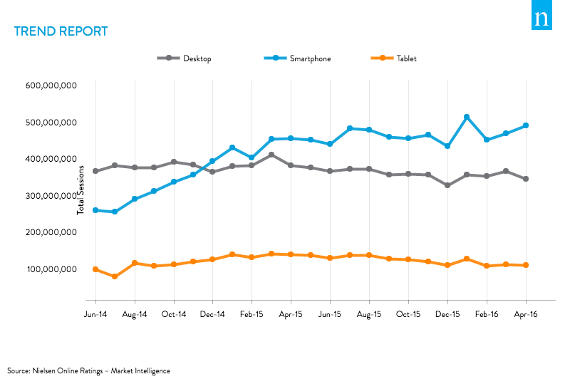
Bam, there you go. Australians are constantly using more mobile devices than desktop devices, and it seems like that trend is gradually increasing as well.
What is mobile-friendliness?
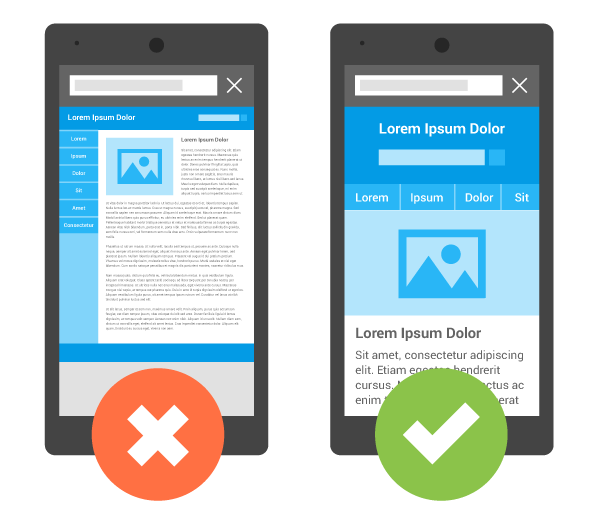
Credit: https://developers.google.com/webmasters/mobile-sites/
In its basics, without a mobile-friendly website, the desktop version is shown on your mobile devices, and you can only imagine how wonky that would look. Everything’s all smooshed together, the text is tiny, the images all requiring magnification, and the formatting, ugh, don’t get me started on the formatting. Undesirable, right? I’d leave the website instantly if it didn’t seem worth it.
Having a mobile-friendly website ensures that all your content is displayed properly and fittingly for relevant mobile devices’ screens. Everything just feels in its right place, and the website just flows. This positive user experience is what can boost the sales in the long run.
Ok, what are my options?
1. Design a responsive website
A mobile-responsive website is essentially a website that adapts its content to fit any screen size. If you’d like to play around with an awesome example, check out the website for Foundation, and resize the browser to different widths to see how all the content adapt to fit different screen sizes.
How?
There are three ways you can make your website responsive:
- Via a trusted plugin
- A trusted plugin includes Foundation, the very website I may have just sent you to. Used by brands such as eBay, HP, Disney, Samsung, Amazon, and Mozilla, it’s hard to deny its credibility. Although it is a plugin, it is no easy feat.
- DIY
- If you’re brave enough to DIY a responsive website, I’d recommend following a detailed guide, such as this beginner guide that uses templates, or this intermediate guide if you’ve got a more technically-adept brain. Both guides are from the Internet’s lord and master, the almighty Google.
- MAWDDIFY (Make A Web Developer Do It For You)
- If you have no clue what I’ve been talking about in this article so far, it’s probably best if you MAWDDIFY. It will cost a lot more, but if you’re willing to spare those funds, it’ll be well worth it in the long run.
This method is more suitable for those who are either starting their website from scratch or have the time, funds, and effort to make their website fully mobile-responsive.
2. Build a mobile website
Now, different to simply making your one website responsive, this method involves creating a separate version of your website that is specifically catered to mobile users. When you access the website on a mobile device, it will contact the desktop website, but then redirect to the relevant mobile version.
Although this isn’t necessarily the best option to go for, as tablets don’t get the optimised experience, it either gets the desktop or mobile version depending on how the redirects work.
How?
The easiest way to build a mobile website is to install one of the many trusted WordPress plugins, including WPtouch or JetPack.
This method is usually for those who want a quick-fix for their mobile-friendly website. It is generally encouraged that you make your website fully responsive, but that’s only if you have the time and moolah.
3. Develop a mobile app
If you’re looking to go super-optimised, you can develop a mobile app for your website or business. Although it is a bigger project, it offers more functionality in terms of using a mobile’s native capabilities.
What I mean by this that a mobile app can utilise several mobile features to its advantage, such as the camera, microphone, on-going notifications, and offline capabilities. There’s no point making a simple informational app — this can easily be done by a website. This way, mobile apps focus more on user experience.
How?
Developing an app is not a walk in the park, it’s more of a fast jog with ankle weights up mountainous sand dunes. You should check out these guides from Entrepreneur, Mashable, and Forbes.